iOS App Library Critique: Sorting Out the Mess
It’s not often that we get a new feature from Apple where we get really excited for it during WWDC, only to end up rarely using it a few weeks after the honeymoon period ends. And that statement has never been truer than it is with the App Library in its current state.

The Concept
The idea behind this feature is really great on paper: it’s a smarter, more elegant version of the App Drawer that had been a staple of Android for a decade by then. It works as a hub for every app you have installed on your iPhone, automatically sorted into folders with 3 most used apps in each appearing as regular icons for quick access. A quick swipe down turns the grid of folders into a uniform list of all apps in alphabetical order.
As stated during the showcase of iOS 14, the App Library is meant to de-clutter the infamously restrictive iPhone homescreen, which, in combination with widgets, was supposed to give the end user a new way to navigate and sort their apps to their liking.
While the concept itself is great on paper and I can definitely speak for everyone when I say I appreciate the new, clean look of my homescreen, it is safe to say that the execution of the App Library leaves a lot to be desired. So where did things go so wrong?
Unintuitive navigation
The first and, in my opinion, most major road-bump when trying to use the App Library is getting to it in the first place. Apple decided to place it at the very end of the homescreen, with no other way of getting to it than either having to scroll all the way to the last page or skip right to it by holding down on the search/scroll indicator button.

Not only does it make it far less likely that the end user will take advantage of this feature, but it also discourages the creation or more than 1–2 homescreen pages, which goes directly against the idea of iOS 15, where the users are encouraged to create more, thematically fitting pages, to then sort them into different Focus Modes.

Apple knows best. Or does it?
Let’s say you’ve done the impossible and only limited yourself to 1–2 homescreens, making the App Library easier to reach. Great! Now comes the worst part of trying to embrace this feature: Smart Folders.

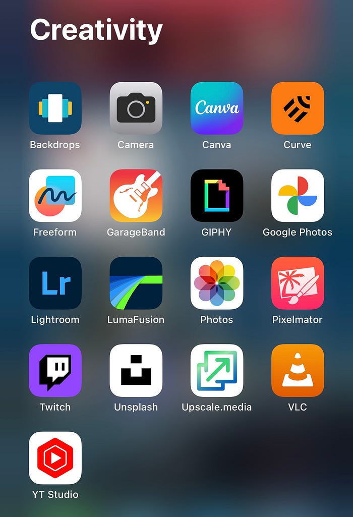
At first, they look great and well-organized! Your entertainment apps are all in one place so you always know where to go, then you have the creativity apps for all of your… wait, why is the Twitch app in “Creativity”? I’m pretty sure the vast majority of people watches Twitch for Entertainment, right? And there’s already a smart folder for it, too. Hold on, what is VLC doing here? You can’t create anything with it, it’s a Utility for viewing and storing files!
The worst part about all this is that such mishaps are everywhere, across all categories. It makes me wish we could manually swap some apps around to fix this sorting nightmare, but Apple doesn’t let you do anything about it: you’re stuck with what your phone decides for you, and searching for the necessary apps feels like a waste of time and effort compared to using Spotlight search instead.
In combination with other, albeit smaller issues, such as inconsistent Smart Folder categories and the search function being next to useless, these two major problems turn the App Library from an awesome idea into a feature that’s barely worth using aside from it being a glorified Hidden Apps folder. What hurts even more is that Apple has seemingly given it next to no attention in its recent iOS updates, treating this new core part of the overall experience as an afterthought.
Can it be fixed?
Personally, I’m a bit of an organization freak, so the overall design and concept of the App Library really appeals to me. As such, this proposed changes are meant to keep Apple’s vision intact while giving the users exactly what they needed this whole time: organization and customization.
FIRST, there needs to be an easier way of accessing the App Library from anywhere on the homescreen. This is where I think Apple should continue, ahem, “innovating and drawing inspiration from its competitors”, by implementing a new swipe up gesture, similar to that for accessing the App Drawer on Android. In essence, it would mimic its implementation on iPadOS, where Apple gave the App Library a dedicated icon in the Dock. That way, it’s possible to access all of your apps from anywhere, even when using the new Stage Manager mode.
This implementation will also fix the issue with the All Apps search feature, as it will only take 2 natural swipes to access this menu, instead of having to sluggishly scroll all the way to the last page and then swipe down.
SECOND, Apple should allow users to manually change the placement of the apps across different categories as they please while still keeping the Smart Folders idea alive by automatically sorting freshly installed apps.
While some may argue that this would lead to confusion when finding the freshly installed apps to begin with, Apple had the foresight to introduce a Recently Added Smart Folder that contains the most recently installed apps, thus making them easier to keep track of.
Conclusion
While we can only speculate if Apple will address the current issues with the App Library in the near future, I definitely hope that we’ll see the App Library as a useful tool that will enhance the experience for the average user and remove the tedium from organizing your homescreen, rather than add to it.
In the meantime, I strongly encourage you to propose changes that you would like to see in the next major iOS release directly to Apple. You can do that by going to the following page: apple.com/feedback, and choosing the product category you have feedback for. As Apple have demonstrated during WWDC 2023, they are listening to user feedback more actively than ever in their new approach to engaging with their customers.
For now though, after almost a year of trying to actively use the App Library in my setup, I’m going to reset my homescreen and treat it as a way to hide the apps I run in the background or use only once in a blue moon.
